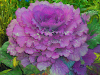
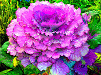
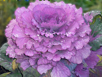
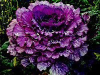
 This ornamental kale was growing at Pioneer Park last summer. I did not capture the full beauty of the sun shining on the raindrops but it is still a lovely picture.
 For this view I used auto color correction and then did further adjustment under Adjust color, hue/saturation. Hue was set at -3, saturation at -54, and lightness at -16 so it would bring out the background greens and yellows. I then used filter, blur, posterize so it would look more like a painting than a photo. I used layers to work in each of the photos. In fact I did a new background with each change so I could easily delete any changes I didn’t care for. This is a feature I appreciate having available. I like this picture on the computer and think I will have it printed in a poster to see if I really like it. I have found I enjoy working with the pictures as much as I enjoy taking them!
 For the second view I wanted to leave it much as it was except blur the background so only the kale itself would get the attention. I used auto smart fix which made the plant a bit paler and I did not make further adjustments to the plant itself. To blur I used the filter, blur, gaussian blur and set the blur at 20.5 pixels. I used the lasso tool to identify the blurred area. I found it necessary to crop the picture after I used the blur because I was not careful enough with the lasso tool and had some bright spots around the edges of the picture. This was my first time using the lasso and blur and I think I will use it as I become more efficient with it. Auto smart fix was probably not the best choice here but it has worked for me on other pictures.
 I wanted to give it a dark velvety look with vivid raindrops so that is the effect of this view. I decided there was no need to crop it. I did apply auto contrast. Then under Lighting—Shadows and highlights: I adjusted the lighten to 16%, darken to 19%, and mid tone to 65%. Brightness, -59; Contrast, +50. Levels : input 213, output, 255. I choose the backlight view under Adjust color curves. These tools allowed me to make the picture look similar to what I had in mind. I especially like the lighting options. The contrast seems to be too stark in most instances but for this version it was what I wanted. I tried to use the soften brush on another picture but didn’t have success.
 I have created a blog which will eventually contain pictures of and comments about all the houses I have stayed in while house sitting in and around Fairbanks. If you care to read about my experiences and see some of the pictures you may log onto http://ionab.blogspot.com/.
No comments:
Post a Comment