
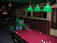
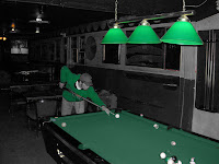
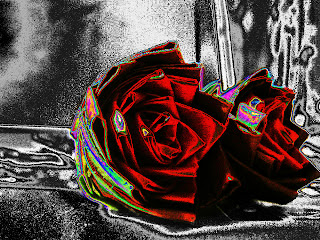
This one I just experimented with the color chanels.

This one I made black and white thought it looked pretty good.

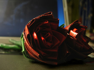
The original looked ok, but the first one, the one I brightend looks the best and does change the way you look at the picture.

I have stopped teaching. I will continue to use this web log to share tools and resources. My former students are still welcome to post to this web log. If any new people want to join the web log and post entries or comments let me know and I will add you to the web log.





 I played with the color temp, but mostly added depth with
 This is when I cropped out the date and filled in the background
 This is one of the editing I did to the picture, I first cropped out
 This is the orig. picture of the University of Montana - Missoula, picture
 I took this picture as a memory to take home. For me this place represents something American, what we don’t have in my country.
 First I cropped the photograph so that it represents better my intention. Then I adjusted the lighting levels, I darkened the highlights from the slider and added saturation. I also sharpened it just a bit. I think this looks much better than the original.
 I wanted to see the picture in black and white, so I converted it. I selected Infrared Effect –style. This picture looks really different in black and white than in coloured. Black and white gives the photo an older atmosphere, like the picture was taken many years ago.
 For the third photograph I copied the background and used hue/saturation –tool. I set the saturation to -100, so the photograph came out black and white. Then I used black brush on the mask to reveal some colour. I think this looks also nice, different than the others.

 I have sharpened the image in my photo using picassa background effect and have used used the basic fix tools and use the auto contract to add effect to this photo.
 I have used the Filter B&W in the effects in picassa and have cropped my photo to get more of the ice sculpture in the photo.
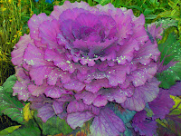 This ornamental kale was growing at Pioneer Park last summer. I did not capture the full beauty of the sun shining on the raindrops but it is still a lovely picture.
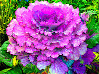 For this view I used auto color correction and then did further adjustment under Adjust color, hue/saturation. Hue was set at -3, saturation at -54, and lightness at -16 so it would bring out the background greens and yellows. I then used filter, blur, posterize so it would look more like a painting than a photo. I used layers to work in each of the photos. In fact I did a new background with each change so I could easily delete any changes I didn’t care for. This is a feature I appreciate having available. I like this picture on the computer and think I will have it printed in a poster to see if I really like it. I have found I enjoy working with the pictures as much as I enjoy taking them!
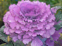 For the second view I wanted to leave it much as it was except blur the background so only the kale itself would get the attention. I used auto smart fix which made the plant a bit paler and I did not make further adjustments to the plant itself. To blur I used the filter, blur, gaussian blur and set the blur at 20.5 pixels. I used the lasso tool to identify the blurred area. I found it necessary to crop the picture after I used the blur because I was not careful enough with the lasso tool and had some bright spots around the edges of the picture. This was my first time using the lasso and blur and I think I will use it as I become more efficient with it. Auto smart fix was probably not the best choice here but it has worked for me on other pictures.
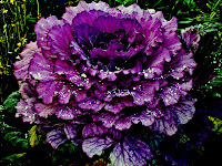 I wanted to give it a dark velvety look with vivid raindrops so that is the effect of this view. I decided there was no need to crop it. I did apply auto contrast. Then under Lighting—Shadows and highlights: I adjusted the lighten to 16%, darken to 19%, and mid tone to 65%. Brightness, -59; Contrast, +50. Levels : input 213, output, 255. I choose the backlight view under Adjust color curves. These tools allowed me to make the picture look similar to what I had in mind. I especially like the lighting options. The contrast seems to be too stark in most instances but for this version it was what I wanted. I tried to use the soften brush on another picture but didn’t have success.