Done in Photoshop 6:
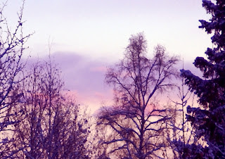
This is the original picture for
part one; assignment steps 1-5, only resized so it won't take up too much room on web page or take forever to upload.
I took this picture today from my office window because the pink and blue in the clouds was
layered in a pretty way. I knew it would need a lot of editing because I thought I might like to make it into a watercolor type picture. I downloaded it from my storage disk.
The following is my usual workflow:
Evaluation & Tuning:
1.) check to see if picture is even worth working on; not obviously blurred or total trash
2.) check to see if it needs to be cropped or straightened
I cropped it
3.) click the "auto color" option to see what changes it will do automatically
4.) after doing this I usually work with the "adjust color, color variations" option because I like to see what will happen when I choose to add more of certain colors
Midtones: increase the reds about 33%
decreased the greens about 33%
Shadows: darken about 33%
Highlights: lighten about 33%
Saturation: 33% darker
5.) after doing these things, the picture looked a little "noisy" so I went to the noise reduction filter
Strength: 8
Preserve Details: 88%
Reduce color noise: 87%
Remove jpeg artifact
6.) after doing this I went to the "levels layer"
I used the slider to get these results: 17, 107 and 249 because it looked good to me.
Effects:
1.) Filter: Artistic Filter: Dry Brush
Brush Size: 1
Brush Detail: 10
Texture: 1
2.) after I did this I thought it would look better if I cropped it even more
3.) flattened image so the layers were all compressed together
4.) resized for e-mail and web page use from 1641 x 1159 to 820 x 579
5.) saved to external hard drive under "water colors"
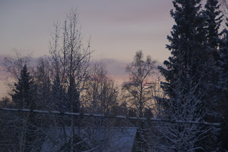
This is the final result:


 3) Exposure
 4) Convert from RAW to PNG