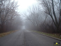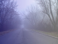
For this photo i duplicated all the layers so i would ruin the original photo. Then i created a new layer and made it a clipping mast. ON that layer i selected a blue fading to white gradient and turned the opacity down to 45. selected the patch tool to get rid of the icon in the corner and some of the white garbage because it distracted my eye. All of that gave the picture a cold foggy morning look.

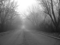
this next one i did most of the same steps but i just desaturated the picture to give it an older look to it.

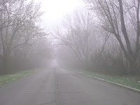
Then this last photo i just mested with the Hue/ saturation setting.
I set the Hue +57
I set saturation -11
I set lightness +28

I like how all the pictures turned out i could not pick one over the other.
No comments:
Post a Comment